
How to choose exterior paint colours that work on a real house
Exterior paint is cheap compared with most renovation jobs, but it is expensive to get wrong: scaffolding, labour and a second coat of a different colour all add up. Most bad choices come from the same handful of mistakes. This guide explains why colours change outdoors, how to narrow your shortlist, and how to test without living with patches on your wall for months.
Why colours look different outside
Three things happen when a colour moves from a swatch to an elevation.
- Scale. A colour covering a whole wall looks lighter and more saturated than the same colour on a small chip. A grey that seems soft on a card can read almost white across a house, and a "muted" green can look surprisingly bright.
- Daylight. British daylight is often cool and diffuse. North-facing walls get no direct sun and push colours towards blue and grey; south-facing walls get warm, direct light that can wash colours out at midday. The same paint will look different on the front and side of the same house.
- Surroundings. Your roof, brick, stonework, window frames, neighbouring houses and even a large tree all reflect colour onto the wall and shift how it reads.
Start with what you cannot change
Before choosing anything, list the fixed elements: the roof colour, any exposed brick or stone, the colour of window frames you are keeping, and the paving. Then hold your shortlisted colours against them, not against a white sheet of paper.
The most useful single question is whether those fixed elements are warm (red brick, buff stone, terracotta tiles) or cool (blue-grey slate, grey concrete tiles, white uPVC). A cool grey paint next to warm red brick tends to look dull and slightly dirty; a warm off-white or stone colour usually sits better. The opposite applies under a dark slate roof, where cool, crisp tones tend to work.
Understand light reflectance value (LRV)
Most paint manufacturers publish a light reflectance value for each colour, on a scale from 0 (absorbs all light, black) to 100 (reflects all light, pure white). It is a far more reliable guide to how light or dark a colour will look on a wall than your impression of the chip.
- Colours with an LRV above about 75 will read as white or near-white on a sunny elevation. If you want an obviously off-white or cream, go lower than you think.
- Very dark colours (LRV below about 15) absorb more heat. They can be striking, but on render and timber they show fading and movement more, and some manufacturers restrict which of their products can be used in dark shades on certain substrates. Check the data sheet.
- For trim to stand out against the main walls, aim for a clear difference in LRV, not just a different hue.
Main colour, trim and door: keep it to three
Most successful schemes use a main wall colour, a trim colour (fascias, soffits, window surrounds, downpipes) and an accent for the front door. More than that tends to look busy on a typical British terrace or semi.
Two common approaches work well:
- Tonal: trim a few shades darker or lighter than the walls in the same family. Calm, forgiving, and good for terraces where you want to fit in.
- Contrast: light walls with dark trim (charcoal, black, deep green). Crisp and modern, but it emphasises every line, so it suits houses with tidy, symmetrical detailing.
Leave the boldest colour for the front door, where it is cheap to change if you tire of it.
Test properly
- Narrow the list visually first. Shortlist two or three colours by seeing them on a photo of your actual house, so you only buy testers for serious contenders. This is where a visualisation tool such as ExAI is genuinely useful: it shows the colour at full scale against your real roof and brick.
- Paint large test boards, not small patches. Paint A3 or larger pieces of card or hardboard with two coats and move them around the house. Patches painted straight onto the wall are hard to judge against the old colour and can show through later.
- Look at different times of day. Check morning, midday and late afternoon, and on an overcast day. Look from the pavement and from across the road, not just up close.
- Check the finished product, not just the colour. Masonry paint, smooth exterior emulsion and mineral or silicate paints have different sheens and breathability. Old solid-wall houses and lime render generally need breathable paint, and a specialist should advise.
Mistakes we see most often
- Choosing a "white" from a small chip and ending up with a glaring, blue-tinged house.
- Ignoring the roof. The roof is often a third of the visible elevation.
- Matching the trim to plastic window frames that are slightly off-white, which makes both look dirty.
- Forgetting the neighbours. On a terrace or semi, your house is read as part of a pair or a row.
Product and substrate advice here is general. Always follow the paint manufacturer's data sheet, and get specialist advice for listed buildings, lime render and other traditional materials.
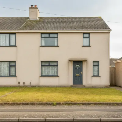 Peinture extérieure
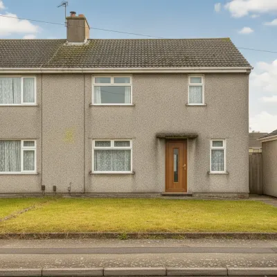 Porte d'entrée
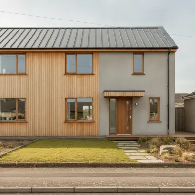 Style de maison complet